No one asked but here’s a brief tutorial on digital underpainting and how it can add some extra flavor to your art!
(I got asked this a couple times so just to clarify: I used “overlay” in the second slide… but the rest of these examples are JUST painted on, no effects! Try playing with the opacity on your pencil/water/brush tool to allow the base color to show through!)
advice for artist studyblrs from an old broke artist: study the shit out of color theory. really. Because not only it will make everything you do more engaging, but it will save you SO MUCH MONEY IN THE FUTURE because you can go by with 4 or 6 basic pigment in your palette and still mix everything you need.
(I say 4 or 6 based on what media you’re using, you can either go by with a cyan-magenta-primary yellow-black like printers or for a wider range for mediums like watercolor and acrylics and oil you can go with a cerulean, cadmium red, cadmium yellow, hansa yellow, quinacridone and ultramarine…)
Really, I’m thanking my teacher every day for those extenuating color mixing exercises because otherwise I’d go broke with buying those goddamn expensive silk colors….
Those who actually want to invest a lot (really expensive), there’s this industry-level course (which means the teacher is art director at dreamworks and worked in disney as well, so yeah, expensive) but REALLY worth it: Designing with color and light by Nathan Fowkes
One of the best exercises you can do to learn how to mix traditional colors properly is take a magazine, cut pieces of paper from it, they must be flat colors! any flat color, the more small pieces the better. then glue them all on a sheet of paper and try to mix pigments to copy that color. The more you try to copy the easier it will get in the end. obviously.
this single post is more useful to me then four years of art school
We did it in color study class on my college and it’s incredible the difference between using red/blue/yellow than cyan/magenta/yellow.
The purple was colored like shit, so as the greens. Than we tried the actuall primary colors and it FELT SO GOOD!
I JUST TESTED IT IN MY ART PROGRAM AND HOLY SHIT
IT WORKED REALLY WELL
On the left we have dissapoinment; on the right, love.
Then why do they teach us that RBY are primary colours in Pre-KG????
To mess with our heads….
Or because they think that cyan and magenta are too difficult for kids to learn? Lame either way
Reshare to save lives
Okay, no. No no no no no no nono NO.
Listen up you fucks because I’m not wasting thousands of dollars on an art degree to watch y’all fuck up basic color theory.
Red, yellow, and blue are the primary colors
If you’re using p i g m e n t.
Do you hear me? When you’re using traditional media, fucking actual goddamn paint, Bob Ross style, your primary colors are!
When you use paint, your primary colors are red yellow and blue and don’t forget it.
NOW THAT CHANGES COMPLETELY WHEN YOU GO FUCKING DIGITAL.
THE DIGITAL PRIMARY COLORS ARE RED BLUE AND GREEN IF AND ONLY IF YOUR WORK IS GOING TO STAY DIGITAL, ON THE SCREEN, AND NEVER LEAVE THE SCREEN, AND OF COURSE IF YOUR WORK IS GOING TO BE PRINTED. ON A PRINTER. WITH INK. THEN. AND O N L Y T H E N.
ARE YOUR PRIMARY COLORS.
CYAN.
MAGENTA.
AND YELLOW.
So say it with me folks!
Red yellow and blue, are the primary colors for traditional pigment that’s mostly used in paints and shit. You use red yellow and blue when you’re painting traditionally, Bob Ross style.
Red blue and green is light, which is what you’re painting with when you pick up your tablet and go digital.
CMYK is ink, and ink only. Youcoulduse cyan, magenta, and yellow as your primary colors in paint if you wanted to be a complete dick, but they’re not your primary colors unless your work is going to be printed using. i n k. The only time they could be considered the primary colors in a traditional medium is if you’re using ink.
Good day.
Also thatswhiskytoyou’s color mixing is bullshit because THIS:
Is my icon. I painted this using RED. GREEN. AND BLUE. AS MY PRIMARY COLORS and they turned out fine. Of course, I used the finger smudge tool first and thenthe color mixing tool and thenthe blur tool, but hey what do I know.
Clearly using the blur tool only doesn’t cut it.
“Oh but Leo!” You say. “You used cyan and magenta in that color wheel!”
Well bitch guess what.
this is the digital color wheel. I’d say I mimicked that pretty well, don’t you think?
Oh and one other thing, notice how Blue and Yellow are directly opposite each other on this color wheel? That’s because we’re dealing with light, and with light, yellow and blue are complimentary colors.
Which is why when you mix them, it looks like this:
Which is a pretty neutral gray tone: They cancel each other out on the rgb color wheel when you mix them together.
BUT WITH PIGMENT THE PLACEMENT IS DIFFERENT
If you’ll notice, yellow and violet are now opposite each other, meaning they’re complimentary colors and if you mix them, they’ll make a neutral gray.
But if you mix yellow and blue, same colors as before, YOU GET THIS:
Now keep in mind that the person in the video uses a darker blue, so they get a darker green, but the point is that it doesn’t make that neutral gray.
Now what happens when we mix yellow and violet paint?
Ah yes, you get a bunch of muted colors the more evenly you mix them.
What happens when you mix yellow light and purple light?
I see, I see.
OH AND ONE MORE THING.
They didn’t teach you about red blue green and cmyk in pre-k because when most of us were in pre-k digital art was still in its early stages and what fucking seven year old knows how to use a printer.
GUESS WHO’S NOT FUCKING DONE YET:
The reason the primary colors for light are so dramatically different from the primary colors for paint and ink is because your eye only receives combinations of red light, blue light, and green light. Our eyes do not have a sensor (cone cell) for yellow light. So when we paint with light, red green and blue are our primary colors. Because of our eyes.
Furthermore, paint primary colors are colors that cannot be created by mixing other colors together. For paint, they are red yellow and blue, because you cannot mix orange and green to get yellow. Mixing orange and purple paint does not make red. And mixing green and purple paint does not make blue.
Mixing blue and green paints will make cyan. Mixing red and blue paints will make magenta.
That’swhy cyan and magenta aren’t primary paint colors.
However, you can’t mix yellow and blue ink and get cyan. You can’t mix red and blue ink to get magenta.
And that’s why cyan and magenta arethe primary ink colors.
Brighter and stronger paints are created through tints and shades, through a thorough understanding of color theory and a few quality paint recipes. Not by bullshit posts on tumblr designed to mislead you.
This popped up in my feed, and I have to respond because, as the famous XKCD comic goes… Someone is wrong on the internet.
When you are talking about mixing light, you are talking about additive color. That’s RGB, that’s how your computer screen works. Every pixel is actually three little lights, a red one, a green one, and a blue one. Turn them all off, you’ve got black, turn them all on, and it looks white. All the colors your screen can display are created by adjusting that mix.
When you are talking about mixing dyes, inks, or paint, you are talking about subtractive color. That’s CMY. Pigments absorb certain light wavelengths and reflect others. When you mix paints, they absorb more light (subtract) and reflect less. So cyan paint is absorbing red light and reflecting blue and green. Yellow paint is absorbing blue light and reflecting red and green. Mix them, and you will get paint that absorbs red and blue light and only reflects green.
“RYB predates modern scientific color theory, which has determined that magenta, yellow and cyan are the best set of three colorants to combine, for the widest range of high-chroma colors. ”
Basically the RYB color model is kind of like the flat Earth model. Yeah, people thought that was how things worked for a long time, and it kind of made sense if you didn’t observe things too closely, but we’ve got new information, man. New shit has come to light.
I expect this person will have some kind of rebuttal that will involve swearing in all caps and posting silly gifs. They might even try to demonstrate how CMY works while working in a digital RGB color space again, which is just… *sigh*
Anyway.
If you are working digitally, you are dealing with additive color, and you are working with RGB light. Yes, of course you can get magenta by mixing red and blue and cyan by mixing green and blue because that is how your computer screen works.
If you are working with paints or pigments, you’re dealing with subtractive color. It’s actually a lot more complex than simple CMY because there is a whole universe of materials that reflect and absorb light differently, which is why there are special paints for super bright colors and such, but the simple fact is that you can mix a lot more colors with CMY than with RYB.
Here’s an isometric illustration we did as part of a rebrand project for Anywheres, a subscription box for flexible workers.
We didn’t know blue would become Pantone’s Colour of the Year at the time but we chose it as a significant brand colour due to its tendency to be viewed as calming, reassuring, pleasant and relaxing - all important factors for flexible workers dealing with an unpredictable and often stressful work-life balance. Interestingly, our research discovered that blue, when used as a main colour on a website, can create the illusion of increased connection speed due to its ability to induce a state of relaxation in the user.
However, blue is not immune to demographic factors and it can often be seen as cold, corporate, bland and even evil. As such, we chose to temper it with oranges and pinks in order to bring out its evocative, emotionally resonant qualities.
#f42069 and #b4da55 are fantastic colors that go so well with each other
Watermelon candy instinct
Cosmo and Wanda dynamic
Splatoon
We really gonna sleep on the fact that the hex code of the green color literally says “badass”? And f 420 69?
The power of this post is too great
The coincidences of the color codes arehilarious, but in seriousness, I’m unsurprised to see them go well together! To those of us with normal color vision* (see footnote 1), color theory actually works pretty well to explain this!
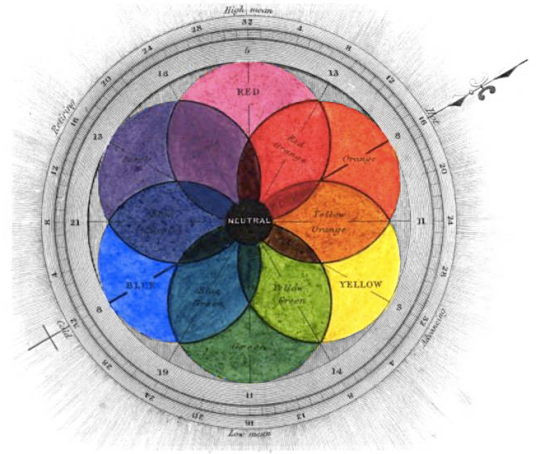
See, in color theory, there’s something called Complementary Colors; this term refers to placement across the Color Wheel from each other:
If you look at this chart, you might notice something: the Primary Colors are all DIRECTLY across from a Secondary Color, while each Tertiary Color is directly across from another Tertiary Color. Those are your “Complementary Color” combos!
As you can see, Red is across from Green on the color wheel,butRed Violet in specific is also across from Yellow Green, making that combo also “complementary”!
Now, not all “color wheel” images bother to show the Tertiary colors (the in-between colors like Blue-Green, Yellow-Green, Red-Violet etc), but Tertiary colors are actually what we’re dealing with here, because the f42069 is pretty darn close to Magenta or Fuchsia, which are particularly red hues of RED VIOLET, while Badass Green here is a Yellow Green hue!
So what does this mean?
It means that BECAUSE of Complementary Colors being a thing, most hues of red-violet, including magenta, should go pretty darn well with most hues of yellow-green.
Or in the words of that article I got the image from: “ [Complementary] colors, such as red and green, can neutralize each other or provide a perfect contrast.”
What does thatmean?
Well, green has no red in it (being a blend of yellow and blue, in terms of pigments, usually) - thus the contrast of an added red hued thing next to it is striking and visually interesting.Likewise, when you edge the red into Violets, you’re adding blue to that one (yes, really, even if it still Looks Pink; color is weird that way), but if you edge the green into “more yellow than blue”, you’re proportionally REMOVING blue from that color…again, you’re adding in an element of contrast.
That’s why it’s called“complementary”** (see footnote 2) - meaning they supplement each other.
In this case, though, I’d also note that the EXACT colors work pretty well together in part because each of them softens the perceived intensity of the other; if you cover one of them, the still-visible one looks slightly more intense! Which in the case of the magenta, IMO, makes it almost toointense on my screen (though that green I personally like even more on its own, tbh, but that’s just me preferring Strong Colors lol).
So, yeah, the combination of them right next to each otherisvery different from the two colors separately!
This is why when I’m designing picture framing for myself or others, especially when it comes to the mat boards that accent the print or drawing, I pull a LOT of colors that are even remotely related to what’s in the image, because you really can see the same color seem to change like MAGIC depending on EXACTLY what other hues or shades you put it next to. :D It’s a particular challenge of working with color, but it can be very fun!
*1st Footnote: it’s worth noting that some people with a different form of color perception see colors in ways those of us without that difference don’t; for example, red-green color blindness means that something I would read as a bright teal would read to them as something in the violet range (because while the blue component stays the same, the green element in teal or blue-green becomes indistinguishable for them from thered element in violets, you know?), which…this changes a LOT about color dynamics, obviously! However, since people on this post like the combination so far? I’m going to go out on a limb here and assumemostof them have so-called “normal” color vision or close to it, with the ability to distinguish not just color in general but at minimum, reds from greens. Still, it’s worth acknowledging that this difference exists, since the Color Wheel and Color Theory were clearly designed by and for people with “normal” color vision that can distinguish ALL those colors, because someone who sees color completely differently might not react the same way to a combination like this that relies on hues commonly impacted by color perception differences
**2nd Footnote: not to be confused with“complimentary”, which is speaking of something/someone in a positive and praising light. “Complimentary” and “complementary” are often homophones in various dialects of English and are literally ONE vowel letter off from each other to begin with, so they’re commonly confused or conflated - and tbh it doesn’t bother me if someone uses the “wrong” spelling because I can usually tell what they mean from context - but they’re ~officially~ two different words, so it was worth noting I figure, especially since some of you folks out there might need to use that tiny scrap of knowledge on SATs or resumes or something someday, idk.
You can probably guess what song I was listening to while I drew this lol.
As my last year of art school kicks in I get less time to work on personal or no-reason art, but hopefully there will be some stuff I can post from my only studio class this semester! I’m keeping my finished senior studio stuff a little secret, but I’ll probably post previews and stuff. :>
Casual reminder that I’ve still got emergency commissions open; this is another example of a one-character piece, though I don’t normally do outlines. Feel free to message me with any questions!
there’s nothing to explain, “vermillion” absolutely is a green word
verde in spanish, italian, portuguese and romanian means green. vert in french means green. verdant means green. viridescent means green. it tracks that vermillion would mean green, and that it doesn’t just proves that english is a ridiculous language with absurd rules.
‘Viridian’ is also green & viridian and vermilion sound very similar. So you can understand the kind of stress I’m under.
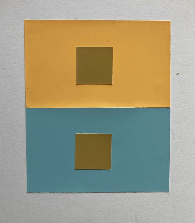
I find this opposite to be true of chartreuse. It should be red. It is green. I have no basis for this.
how I see it in my head
I am one hundred percent in agreement with this. It’s also jangling the funnies with the idea of the bemused face of anyone with red/green colour blindness.
I understand but it comes from the Latin word for “worms” so… that’s pretty cool, I love worms so I love the worm color
Had a lot of fun messing around with color and made this. Looks a little derpy but I like how it turned out (also I kinda wanna turn these two into OCs…. )